
Recently, I decided to investigate performance and ran into a CSS coverage problem. Although this is nothing new, it is not discussed very often in modern stacks using webpack, Next.js, Babel, and similar tools, so it can easily be overlooked.
Even though people do not talk about it much, Google keeps changing its code, and CSS is a real issue that can hurt your site's ranking.
I therefore ran a few tests with a new stack to see how chunks behave when using concepts such as dynamic import and tools such as next/dynamic. This article presents the results of those experiments.
The demonstration used the following tools:
next - 12.1.6
react & react-dom - 18.1.0
SCSS (SASS) - 1.52.1
Typescript - 4.7.2
You can find the code in this GitHub repository.
Test 1 — Validating hypotheses
The first test uses a component—a simple button—that receives a prop and changes color between primary, secondary, and tertiary.
Version A (without code splitting)
The static component simply imports the SCSS (or CSS) module as a large object and passes the class name to the button. Nothing unusual here.
//src/components/test-1/static/index.tsx
import React from 'react';

import style from './static.module.scss';

interface StaticButtonProps {
  children: React.ReactNode;
  state: 'primary' | 'secondary' | 'tertiary';
}

const StaticButton = ({ children, state }: StaticButtonProps) => {
  return <button className={style[state]}>{children}</button>;
};

export default StaticButton;
SCSS module:
//static.module.scss
.primary {
  background-color: #00bcd4;
  color: #fff;
}

.secondary {
  background-color: #f44336;
  color: #fff;
}

.tertiary {
  background-color: #ff9800;
  color: #fff;
}
Now call the component from a page and pass any one of those props:
//pages/test-1-a.tsx
import React from 'react';

import StaticButton from '../src/components/test-1/static';
const test = () => {
  return (
    <div>
      Hello world <StaticButton state="secondary">Secondary</StaticButton>
    </div>
  );
};

export default test;
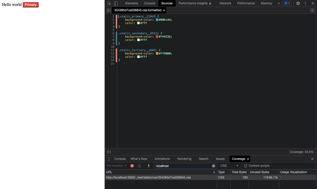
As the image below shows, the component renders with the secondary color. The coverage report shows that only one of the three CSS classes is used, giving us just 33% coverage—or 66% unused code sent to the user.
To fix this problem—or at least try—we need to optimize the code. We will do that with dynamic imports.
Version B (with code splitting)
For the second case, we split the CSS for each state into a separate file and load it with a dynamic import.
//primary.module.scss
.primary {
  background-color: #00bcd4;
  color: #fff;
}
//secondary.module.scss
.secondary {
background-color: #f44336;
color: #fff;
}//tertiary.module.scss
.tertiary {
background-color: #ff9800;
color: #fff;
}Because dynamic imports are based on promises, we need a few tricks to handle their asynchronous behavior. That is why useEffect and useState are necessary here.
//src/components/test-1/dynamic/index.tsx
import React, { useEffect, useState } from 'react';

interface DynamicButtonProps {
  children: React.ReactNode;
  state: 'primary' | 'secondary' | 'tertiary';
}

const DynamicButton = ({ children, state }: DynamicButtonProps) => {
  const [style, setStyle] = useState({});

  useEffect(() => {
    const handleStyle = async () => {
      switch (state) {
        case 'primary':
          setStyle((await import('./primary.module.scss')).default);
          break;
        case 'secondary':
          setStyle((await import('./secondary.module.scss')).default);
          break;
        case 'tertiary':
          setStyle((await import('./tertiary.module.scss')).default);
          break;
        default:
          break;
      }
    };
    handleStyle();
  }, [state]);

  return <button className={style[state]}>{children}</button>;
};

export default DynamicButton;
Calling this component from the page gives us:
// pages/test-1-b.tsx
import React from 'react';
import DynamicButton from '../src/components/test-1/dynamic';

const test = () => {
  return (
    <div>
      Hello worldssss <DynamicButton state="tertiary">Tertiary</DynamicButton>
    </div>
  );
};

export default test;
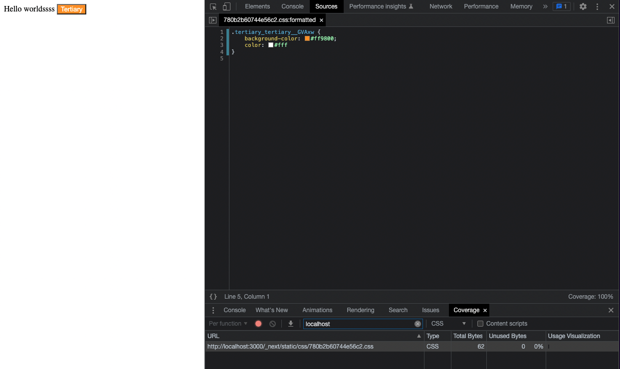
The image below shows that the new test succeeds: coverage reaches 100%, demonstrating that tree shaking works as expected.
Writing a component this way is not practical, but the proof of concept shows the potential of lazy loading. That leads us to the second test case.
Test 2 — A more practical example
Components whose trees change significantly offer greater potential gains. One example is a card whose inner elements and colors vary by category.
Version A — Without code splitting
The main card component receives a prop and renders a different inner component depending on its value.
// src/components/test-2/static/index.tsx
import React from 'react';

import style from './static.module.scss';

// Imports fixos
import Car from './sub/car';
import Processor from './sub/processor';
import Book from './sub/book';

interface StaticCardProps {
  type: 'processor' | 'car' | 'book';
}

const StaticCardComponent = ({ type }: StaticCardProps) => {
  return (
    <div className={style.card}>
      {type === 'car' && <Car />}
      {type === 'processor' && <Processor />}
      {type === 'book' && <Book />}
    </div>
  );
};

export default StaticCardComponent;
I will show only one inner component as an example; you can find the others in the GitHub repository.
// src/components/test-2/static/sub/book.tsx
import React from 'react';

import style from '../static.module.scss';

const book = () => {
  return (
    <div className={style.book}>
      <h2 className={style.title}>Book</h2>
      <p className={style.editor}>
        Editor: <label>Planet</label>
      </p>
      <p className={style.ean}>
        EAN: <label>ADS234556</label>
      </p>
      <p className={style.price}>
        Price: <label>R$ 87</label>
      </p>
    </div>
  );
};

export default book;
Our SCSS file looks like this:
.card {
  height: 100%;
  width: 200px;
  background-color: #fff;
  border-radius: 4px;
  box-shadow: 0 2px 4px 0 rgba(0, 0, 0, 0.2);
  display: flex;
  flex-direction: column;
  justify-content: space-between;
  align-items: center;
  padding: 20px;
}

.car {
  background-color: aquamarine;
  padding: 0 20px 20px;
}
.processor {
  background-color: bisque;
  padding: 0 20px 20px;
}
.book {
  background-color: cornsilk;
  padding: 0 20px 20px;
}

.title {
  font-size: 24px;
  font-weight: bold;
  color: #333;
}

.item {
  font-size: 16px;
  font-weight: bold;
  & > label {
    font-weight: normal;
    font-style: italic;
  }
}

.generation {
  color: blue;
}

.price {
  font-size: 20px;
  font-weight: bold;
  color: red;
}
Notice that the SCSS file contains properties that do not appear in book.tsx, and vice versa. Let us put it on a page and see what happens.
// pages/test-2-a.tsx
import React from 'react';
import StaticCardComponent from '../src/components/test-2/static';

const test2A = () => {
  return (
    <div>
      <StaticCardComponent type="book" />
    </div>
  );
};

export default test2A;
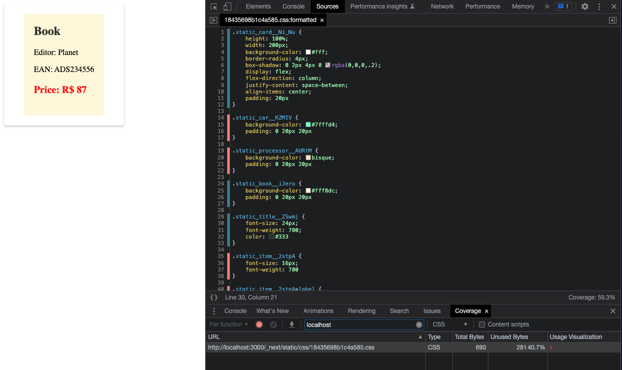
The next image shows that the classes used by the processor.tsx and car.tsx variants are not used, which lowers our coverage.
Version B — Using Next/Dynamic
Because the inner components are already separate, switching to next/dynamic is much simpler: we only need to change how they are imported, plus make a few small adjustments.
The main component becomes:
// src/components/test-2/dynamic/index.tsx
import React from 'react';
import dynamic from 'next/dynamic';

import style from './dynamic.module.scss';

interface StaticCardProps {
  type: 'processor' | 'car' | 'book';
}

const DynamicCar = dynamic(() => import('./sub/car'));
const DynamicProcessor = dynamic(() => import('./sub/processor'));
const DynamicBook = dynamic(() => import('./sub/book'));

const StaticCardComponent = ({ type }: StaticCardProps) => {
  return (
    <div className={style.card}>
      {type === 'car' && <DynamicCar />}
      {type === 'processor' && <DynamicProcessor />}
      {type === 'book' && <DynamicBook />}
    </div>
  );
};

export default StaticCardComponent;
The main style sheet now contains only the styles shared by every variant—the ones used directly in index.tsx.
// src/components/test-2/dynamic/dynamic.module.scss
.card {
  height: 100%;
  width: 200px;
  background-color: #fff;
  border-radius: 4px;
  box-shadow: 0 2px 4px 0 rgba(0, 0, 0, 0.2);
  display: flex;
  flex-direction: column;
  justify-content: space-between;
  align-items: center;
  padding: 20px;
}

.title {
  font-size: 24px;
  font-weight: bold;
  color: #333;
}

.item {
  font-size: 16px;
  font-weight: bold;
  & > label {
    font-weight: normal;
    font-style: italic;
  }
}

.price {
  font-size: 20px;
  font-weight: bold;
  color: red;
}
Returning to book.tsx, it can use both the base styles from dynamic.module.scss and its own styles from book.module.scss.
import React from 'react';

import styleBase from '../dynamic.module.scss';
import localStyle from './book.module.scss';

const book = () => {
  return (
    <div className={localStyle.book}>
      <h2 className={styleBase.title}>Book</h2>
      <p className={styleBase.item}>
        Editor: <label>Planet</label>
      </p>
      <p className={styleBase.item}>
        EAN: <label>ADS234556</label>
      </p>
      <p className={styleBase.price}>
        Price: <label>R$ 87</label>
      </p>
    </div>
  );
};

export default book;
Styles for book.tsx:
// src/components/test-2/dynamic/sub/book.module.scss
.book {
  background-color: cornsilk;
  padding: 0 20px 20px;
}
Bundle it into a page and test it:
import React from 'react';
import DynamicCardComponent from '../src/components/test-2/dynamic';

const test2A = () => {
  return (
    <div>
      <DynamicCardComponent type="book" />
    </div>
  );
};

export default test2A;
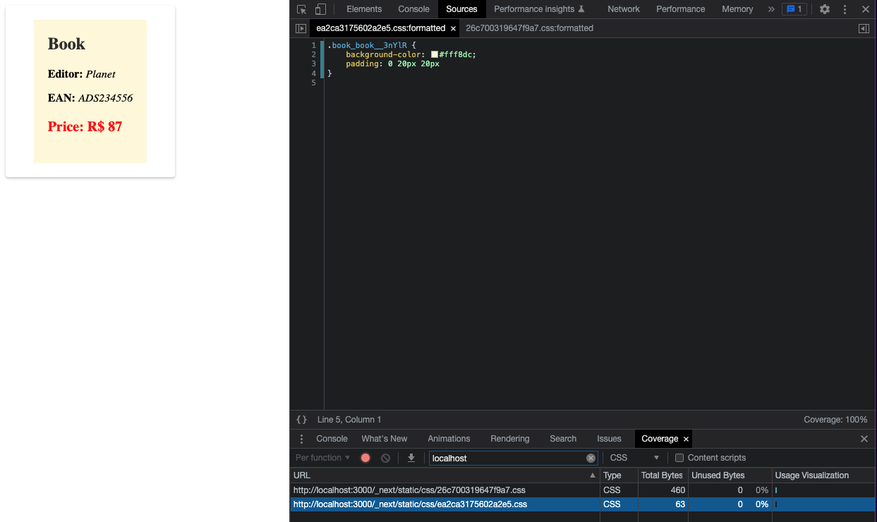
The first new detail is that the browser now receives two CSS files instead of one.
The first file contains every class used to build the card. It is our dynamic.module.scss, with a beautiful 100% coverage.
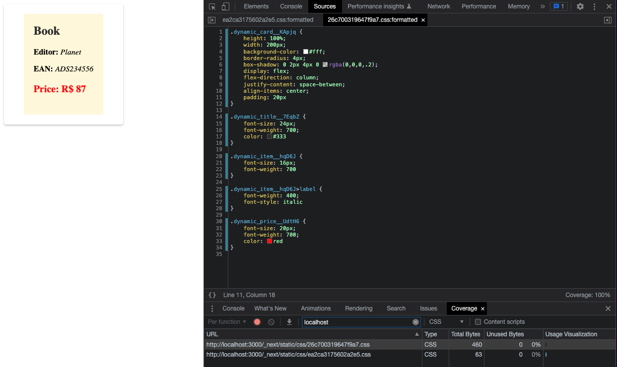
The second file contains the class specific to our Book and none of the other variations—so it also reaches 100% coverage 🤩.
Final thoughts
Optimizing an application can feel thankless: small improvements take time, and it takes even longer for those incremental gains to produce a meaningful impact.
The opposite is not true, though. A few small oversights are enough to send an application into a downward performance spiral, making it slower and slower until a broad, urgent refactor becomes unavoidable.